Introduction
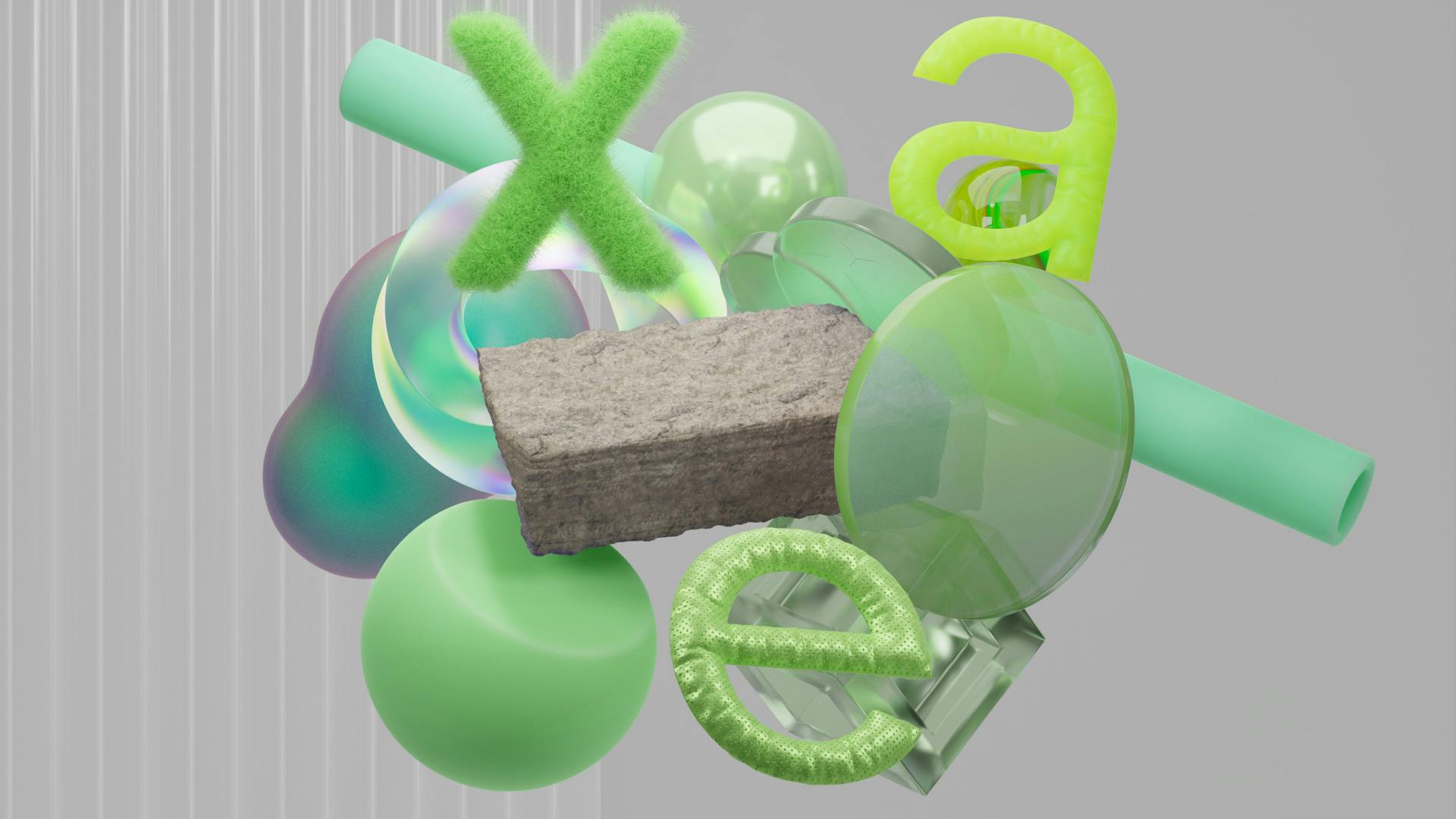


Neue Grotesk Sans Pro is a geometric san serif typeface designed to be a bit friendly. That said looking back at it, and determining now how it reads to me, the word I would use to describe it is energetic. What can I say I wanted to try type design, and the curiosity, enthusiasm, and optimism folded into the work through the confines of the format to make Neue Grotesk Sans Pro.
Research


Neue Grotesk Sans Pro is a geometric san serif typeface designed to be a bit friendly. That said looking back at it, and determining now how it reads to me, the word I would use to describe it is energetic. What can I say I wanted to try type design, and the curiosity, enthusiasm, and optimism folded into the work through the confines of the format to make Neue Grotesk Sans Pro.
Naming
To be honest Neue Grotesk Pro Sans Display Text was not my first choice for a name or even my tenth. Un-fortunately every name I devised was already taken by another font. It got to the point where I did not even want to look them up so that I could not worry about it for a bit. Then I decided on a name that was made of borderline typographic non-sense. In keeping with my tradition of not-taking myself to seriously.
Future updates
Ultimately I would like to focus on creating a three weights for my typeface a light, medium, and bold. In the future I may expand towards an italic, but most likely my type crafting future will involve a lot of custom kerning more than anything else.